top of page

Google Hackathon
A multidisciplinary team effort in developing a digital product

Project Overview
Problem Space
Users do not understand how their data is collected, stored, or used by online companies, and this leads to distrust and uncertainty from them
Opportunities exist to empower users through information, education, or digital tools

70% [of users] are willing to share even more personal data with the organizations they interact with online, so long as they believe that the exchange will benefit them.
Source

How Might We
Create a meaningful solution to improve user privacy through data education?
More Findings
(Data Scientists)
Data sets were provided by Google for the data scientists to research and interpret in our presentation


Primary Persona
Based on research, pain points, and goals
"Divide and conquer" was a strategy employed because of the 24-hour time limit. However, final design decisions were collaborated on and agreed upon by team members
I provided a sketch of a persona, as we were doing research and discovery, and we discussed how to further refine him to be inline with the behaviors, goals, and pain points.


We decided on a revision that a co-UX team member finalized for us, utilizing Google's colors and adding more white space.
Mark's Journey Map highlights pain points and opportunities for our digital product. This was referred to as we discussed possible solutions for our user, and this was developed by a co-UX designer.

Our Digital Solution
Extremely short on time for the 24-hour challenge, our team deliberated on solutions
Data education was the challenge, so I thought as a former teacher and suggested educational "prompts" or a bot
Our team discussed
symbols of "security"
for user data and what our caricature could look like
...A sword
...A shield
...A fortress
A ROOK!


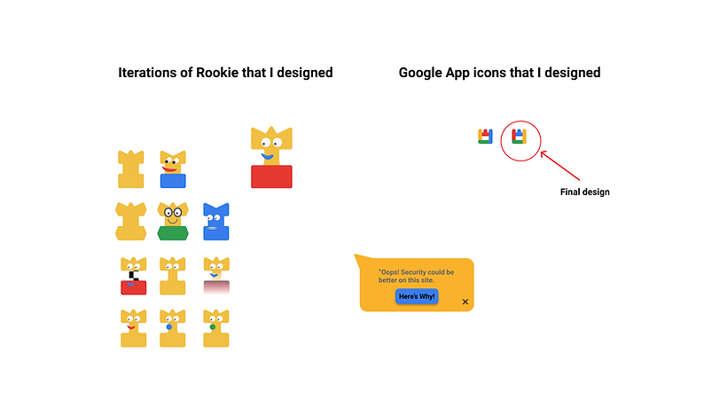
Web Design
UX designers went to work designing pages for developers to code into the final product


I recreated a Google search page to begin our persona's journey, and integrated the plugin icon at the top of the page
Another UX design team member created the search results page


I created a homepage for a fictitious furniture store, which included the Rookie plugin at the top right
However, since the checkout page had more white space, and in order to create a more uniformed look, the page was recreated by a co-UX designer


The checkout page was created by another designer, while Rookie and the text box were added by me.
The final page that links to Rookie's information blurb was designed through a collaborative effort

Winner Announced

Final Thoughts

bottom of page